|
APIA, Samoa, Nov. 11, 2025 /PRNewswire/ -- Phemex, one of the most efficient crypto exchanges, unveiled a refreshed logo and upgraded platform design, marking the beginning of its broader rebranding journey. The new visual identity mirrors Phemex's ongoing evolution from a high-performance trading venue into a comprehensive digital asset platform, uniting speed, precision, and user-centric simplicity under one cohesive aesthetic.
Key Visual Enhancements
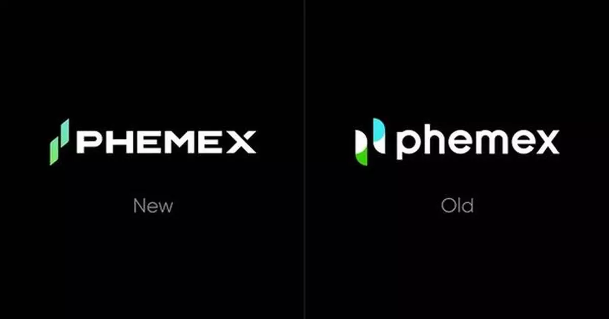
- New Logo Design: Phemex's new logo evolves into a dynamic two-candle composition — a minimalist form symbolizing growth, movement, and upward momentum. The twin lines also convey balance, continuity, and duality between performance and reliability.
- Refined Gradient Palette: The updated color gradient transitions from deep green, representing stability and trust, to bright blue, expressing innovation and forward energy. This one-of-a-kind spectrum reinforces the brand's association with prosperity and progress.
- Refined Typography: Letterforms are now built on a distinct geometric foundation, moving away from softer curves to stronger, more squared edges. This precision-engineered wordmark conveys a heightened sense of reliability and architectural integrity.
- Modernized Platform Interface: Updated 3D visuals, a unified icon system, and lightweight layouts enhance usability and focus, offering traders a cleaner, more intuitive environment across both desktop and mobile.
This marks the third logo in Phemex's history. The original design was inspired by the laurel crown of the Greek goddess Pheme — a symbol of victory and prestige.
"Our new logo and platform design embody what Phemex stands for today — precision, performance, and progress," said Federico Variola, CEO of Phemex. "This redesign is not merely aesthetic; it reflects the mindset that has always defined Phemex — building for the future while staying true to our core of efficiency and reliability. As we evolve, we continue to provide an environment where traders can act with clarity and confidence."
This visual refresh marks the foundation of a broader rebranding initiative that Phemex will roll out in the coming weeks. The company plans to introduce a new house of brands and a unified identity system that reflects its long-term vision — to redefine what efficiency and trust mean in the future of digital finance.
About Phemex
Founded in 2019, Phemex is the most efficient crypto exchange trusted by over 6 million traders worldwide. The platform offers spot and derivatives trading, copy trading, and wealth management products that combine seamless functionality with institutional-grade security. Known for its reliability and innovative edge, Phemex stands out for prioritizing user experience and transparency in an industry where trust is essential.
For more information, please visit: https://phemex.com/
APIA, Samoa, Nov. 11, 2025 /PRNewswire/ -- Phemex, one of the most efficient crypto exchanges, unveiled a refreshed logo and upgraded platform design, marking the beginning of its broader rebranding journey. The new visual identity mirrors Phemex's ongoing evolution from a high-performance trading venue into a comprehensive digital asset platform, uniting speed, precision, and user-centric simplicity under one cohesive aesthetic.
Key Visual Enhancements
- New Logo Design: Phemex's new logo evolves into a dynamic two-candle composition — a minimalist form symbolizing growth, movement, and upward momentum. The twin lines also convey balance, continuity, and duality between performance and reliability.
- Refined Gradient Palette: The updated color gradient transitions from deep green, representing stability and trust, to bright blue, expressing innovation and forward energy. This one-of-a-kind spectrum reinforces the brand's association with prosperity and progress.
- Refined Typography: Letterforms are now built on a distinct geometric foundation, moving away from softer curves to stronger, more squared edges. This precision-engineered wordmark conveys a heightened sense of reliability and architectural integrity.
- Modernized Platform Interface: Updated 3D visuals, a unified icon system, and lightweight layouts enhance usability and focus, offering traders a cleaner, more intuitive environment across both desktop and mobile.
This marks the third logo in Phemex's history. The original design was inspired by the laurel crown of the Greek goddess Pheme — a symbol of victory and prestige.
"Our new logo and platform design embody what Phemex stands for today — precision, performance, and progress," said Federico Variola, CEO of Phemex. "This redesign is not merely aesthetic; it reflects the mindset that has always defined Phemex — building for the future while staying true to our core of efficiency and reliability. As we evolve, we continue to provide an environment where traders can act with clarity and confidence."
This visual refresh marks the foundation of a broader rebranding initiative that Phemex will roll out in the coming weeks. The company plans to introduce a new house of brands and a unified identity system that reflects its long-term vision — to redefine what efficiency and trust mean in the future of digital finance.
About Phemex
Founded in 2019, Phemex is the most efficient crypto exchange trusted by over 6 million traders worldwide. The platform offers spot and derivatives trading, copy trading, and wealth management products that combine seamless functionality with institutional-grade security. Known for its reliability and innovative edge, Phemex stands out for prioritizing user experience and transparency in an industry where trust is essential.
For more information, please visit: https://phemex.com/
** The press release content is from PR Newswire. Bastille Post is not involved in its creation. **
Phemex Introduces Refreshed Logo and Platform Design, Ushering in a New Brand Era
LOS ANGELES, April 1, 2026 /PRNewswire/ -- Following the release of several authoritative 2025 annual AR market reports, one brand has consistently emerged as the industry leader: RayNeo. Despite varying statistical methodologies across firms, the conclusion remains unanimous—RayNeo has secured the No.1 position in both global and Chinese markets. In just four years since its inception, the AR pioneer has achieved a "no-suspense" lead, dominating key regions with record-breaking growth.
Dominating Global and North American Markets
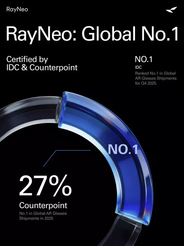
According to the Counterpoint Research 2025 Global AR Smart Glasses Brand Shipment Report, RayNeo commanded a 27% share of global shipments in 2025, ranking first worldwide. The brand saw explosive growth in Q4 2025 across China, North America, and Europe.
Data from IDC further confirms RayNeo's global leadership in Q4 2025, highlighting a "phenomenal breakthrough" in the North American market, where RayNeo's shipments surged by 456.5% year-over-year. Consequently, IDC noted in its report that the smart glasses sector has officially entered an era led by Chinese brands.
Full-Stack Innovation and Global Ecosystem
RayNeo's ascent is fueled by its deep commitment to R&D in near-eye display, spatial computing, AI large models, and human-computer interaction. By achieving full-link self-research and mass production of core optical solutions, RayNeo has built a formidable technical moat.
- X Series: All-scenario AI+AR glasses.
- Air Series: The "super blockbuster" focused on immersive viewing.
- V Series: Specialized AI filming glasses.
RayNeo's services now span over 30 countries and regions, with a strong retail presence in global mainstream channels such as Amazon and Best Buy. RayNeo's ecosystem has received several praises, signaling the brand's success in moving AR from "tech novelty" to "daily essential."
Strategic Financing and Ecosystem Expansion
RayNeo's market leadership is supported by robust capital backing and a rapidly expanding global partner network. In Q1 2026, the company successfully completed a financing round exceeding $140 million (approx. 1 billion RMB), led by an investment group including CITIC Goldstone and strategic funds from industry giants China Mobile and China Unicom.
Alongside this financial growth, RayNeo is deepening its technical integration with world-class telecommunications partners, including China Mobile, and China Unicom. These collaborations focus on building a 5G+AR+AI ecosystem centered on eSIM technology, advanced AI models, and cloud services. Additionally, RayNeo continues to co-create diverse application scenarios with global tech leaders such as Google, Applied Materials, SeeYA Technology, Alibaba Cloud, Ant Group, and Tencent, further accelerating the maturity of the global AR industry.
About RayNeo
RayNeo is the global leader in consumer Augmented Reality (AR) glasses, dedicated to transforming everyday life for one billion people. As the Official Worldwide Olympic Partner in the AR glasses category, the company represents the forefront of immersive technology. Its product portfolio features the AI-enhanced, full-color display X Series and the portable, large-screen Air Series, designed for versatility and high-quality viewing. According to Counterpoint Research, RayNeo dominated the global AR glasses market in Q3 2025, capturing a 24% market share and securing the top position worldwide.
Contact
PR Manager: Sophie
Email: lixj@rayneo.com
** This press release is distributed by PR Newswire through automated distribution system, for which the client assumes full responsibility. **
RayNeo Leads Global AR Market with One-Third Share